A Neo-Grotesque Heritage
Acumin is a new voice in a rich typographic tradition of sans serifs — a heritage over a century in the making.
Although Acumin is based squarely on the neo-grotesque tradition, which has been one of the dominant styles in typography for more than a century, it is an original design, a fresh approach to the tradition; it is not a variation or an interpretation, nor is it a reply to any existing neo-grotesque typeface. It’s Robert Slimbach’s own take on the neo-grotesque category. Acumin brings a subtle humanity to the architectural and modular form of the neo-grotesque.
Accidentally grotesque
Like their kin the slab serifs, sans serifs became popular in the explosion of advertising in the early 19th century. Many of the early sans-serif type designs were quite heavy, which reflected their intended use in eye-catching headlines. But over the course of the century, type foundries developed a host of lighter weights and more text-friendly forms.
The one that everyone remembers is Akzidenz Grotesk, which was released by the Berthold foundry in Germany in 1898. (“Akzidenz” isn’t about accidents but about everyday tasks. Akzidenzarbeit is “job-work,” such as the ordinary small print jobs that are the bread and butter of any small print shop.) Akzidenz Grotesk was actually a compilation of several existing sans-serif typefaces, reworked and marketed as a single family. With its horizontal and vertical strokes of almost the same thickness and its regularized capital letters with few variations of width, Akzidenz Grotesk stood out starkly on the page — especially when that page also included the highly-decorated types that were popular in the same era. Many other 19th-century German type foundries released similar workhorse sans serifs, as did their American contemporaries.
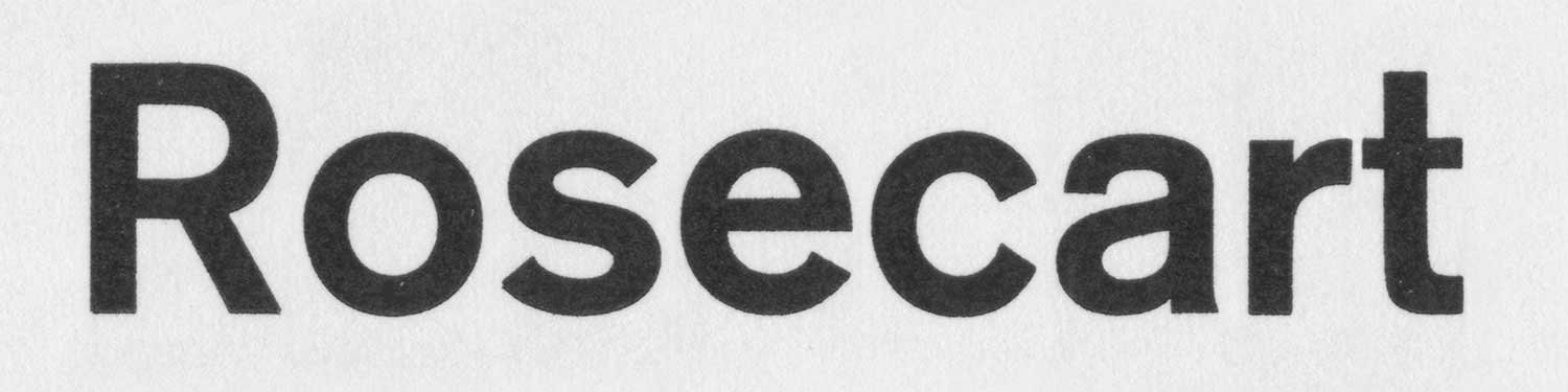
Akzidenz-Grotesk halbfett, printed from original letterpress type.
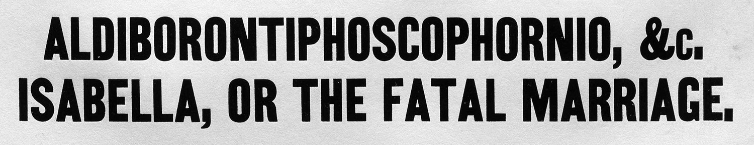
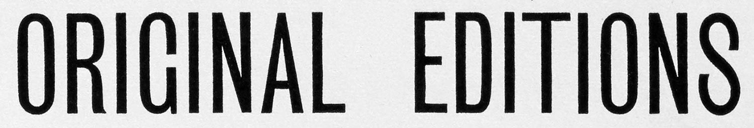
Two-Line Pearl Condensed. Henry Caslon, Specimen of Printing Types, London, 1844.
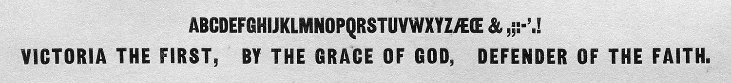
Early sans serif, heavy and narrow even at small size. Great Primer Two-Line Condensed. Henry Caslon, Specimen of Printing Types, London, 1844.
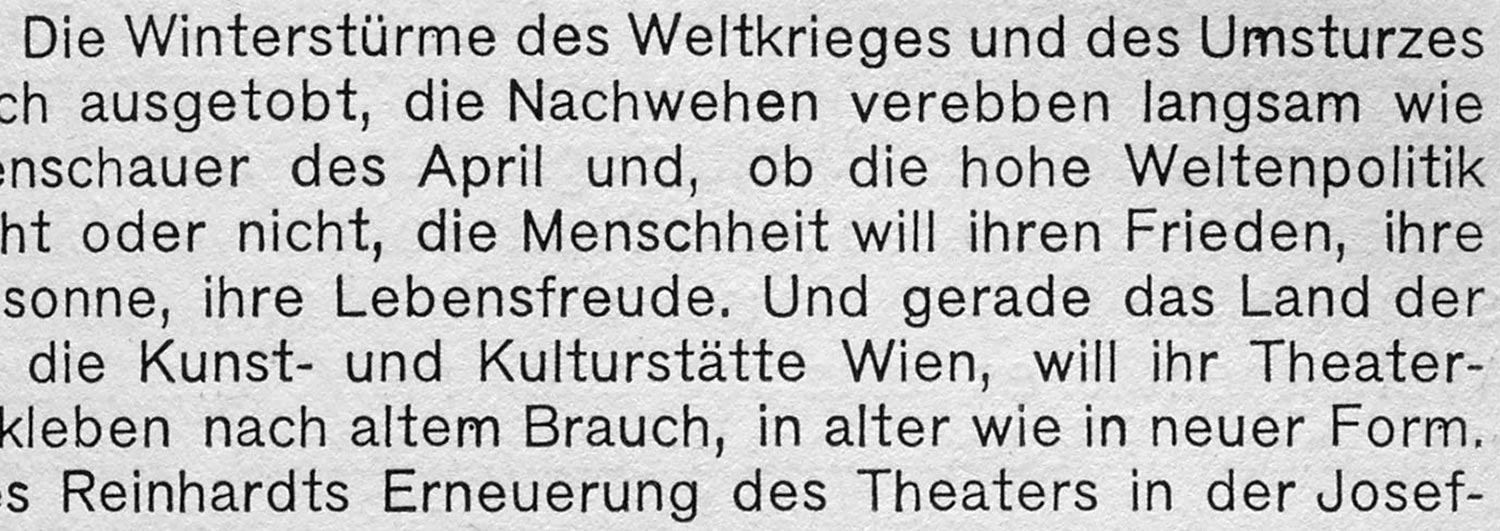
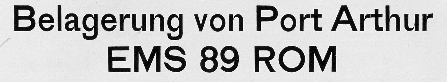
A somewhat later German sans serif with a lowercase designed for use in running text. Waldheim-Eberle A.G., Werkschriften, Vienna, ca. 1930.
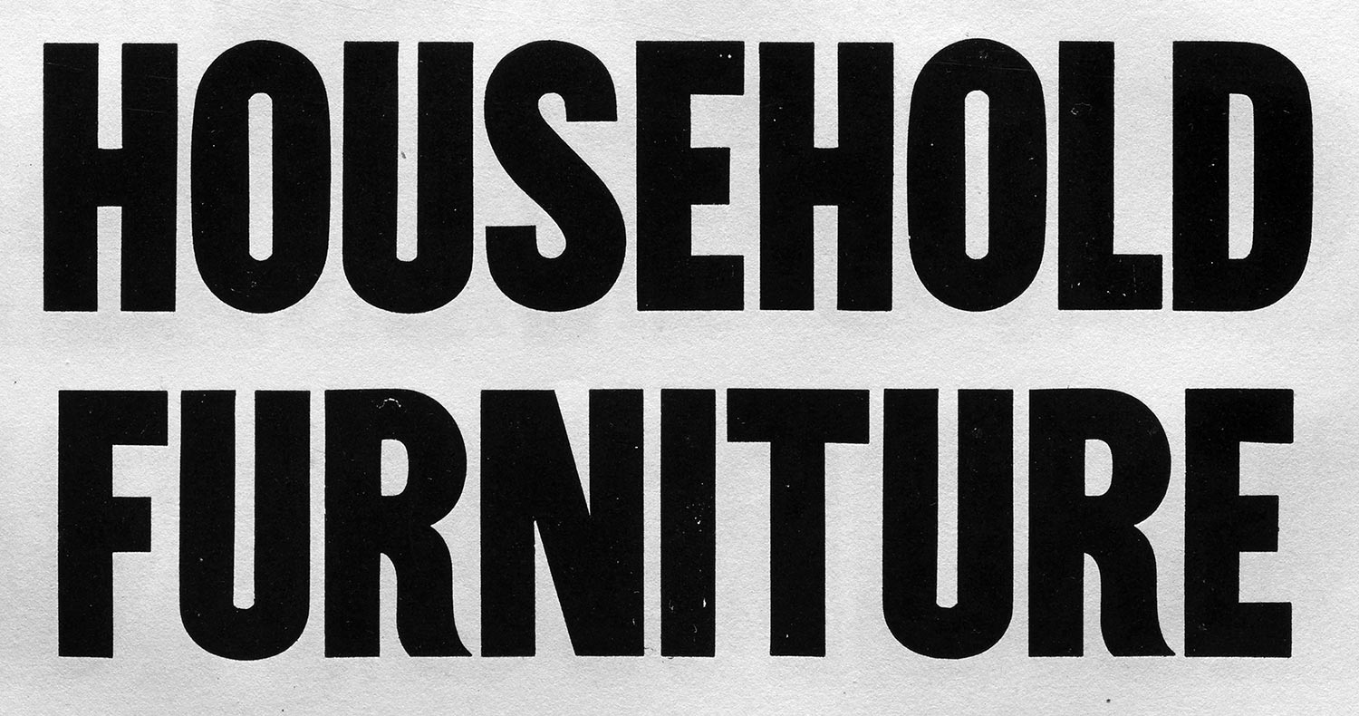
Functional and clear for everyday display use. German grotesques of the 19th century. Schelter & Giesecke Schmale Grotesk. J.G. Schelter & Giesecke, Proben, vol. 1, Leipzig, ca. 1898.
Bauer’sche Giesserei’s Breite magere Grotesk. Bauer’sche Giesserei, Musterbuch der Bauer’schen Giesserei, Frankfurt and Barcelona, 1900.
Sans serifs came into their own as potential text typefaces in the 20th century, under the influence of modernist design movements. The desire to be up to the minute and to reflect a modern industrial aesthetic led to the development of many new styles of sans-serif type, including geometric and eventually humanist sans. The grotesque style itself was revived, updated, and reworked many times, most notably in the two dueling sans serifs of the late 1950s: Helvetica and Univers. These mark the point at which we can start calling a typeface neo-grotesque.
Helvetica is an interpretation; Univers is a rethinking. Helvetica shares the simple, monoline regularity of Akzidenz Grotesk, but with a larger x-height and rigorously horizontal or vertical stroke ends. Although the Helvetica family is more rational than many of its haphazard predecessors, it has none of the systematic harmony that Adrian Frutiger gave to Univers when he developed that family for Deberny & Peignot.
Frutiger took the clunkiness out of the grotesque, gave it a well-woven texture that managed both to look smooth and read well, and organized the widths and weights of the Univers family into a single body with a numeric naming system that reflected their carefully modulated variations. The letterforms of Univers appear more refined, controlled, and deliberate than those of either Helvetica or the earlier Akzidenz Grotesk.
Univers 65 halbfett, printed from original letterpress type.
Helvetica halbfett, printed from original letterpress type.

Aurora Grotesk, from the C.E. Weber type foundry in Stuttgart, one of the many 20th-century adaptations of 19th-century forms into neo-grotesques. Schriftgiesserei C.E. Weber, “Aurora Grotesk,” Stuttgart, [1928].
It was Helvetica, though, that captured the imagination of so many graphic designers and led it to be canonized as the epitome of modern, generic, unfussy typography. Helvetica was ubiquitous in the small typesetting shops of the 1960s and 1970s, in much the same way that those earlier grotesques had dominated the “job-work” coming out of turn-of-the-century print shops (and in much the same way that Arial dominates the everyday business documents of today).
Of course, this hasn’t stopped type designers from reworking the old grotesque – sometimes harking back to the perceived roots of the style, other times starting from scratch and re-envisioning it for the future.
Neo-grotesquerie
So what characterizes a grotesque typeface? What distinguishes it from a geometric sans or a humanist sans?
Besides having no serifs, grotesque typefaces usually have a blocky appearance, and the letters have squarely cut ends (whether cut obliquely or at 90°). The forms are closed rather than open; even when the counters are large, at the lighter weights, the apertures remain very small.
At lighter weights, grotesques appear to be monoline, but this doesn’t distinguish them from geometric sans or even from many slab-serif faces. At heavier weights, however, grotesques may show a strong contrast between the dominant thick strokes and the much thinner strokes or angles that are necessary at the joins. Although this subtle refinement lightens the effect of the merging strokes, it also allows the thick strokes to be even thicker; the effect is to give them a heavy, almost brutal appearance.
Light condensed letters showing very tight apertures and squarely cut ends. Unusually, the G has a spur but no cross-bar. The leg of the R departs from the severe monolinear effect of the other letters. Miller & Richard’s Two Line Double Pica Sans-Serif No. 8. Miller & Richard, Specimens of Book Newspaper Jobbing and Ornamental Types, Edinburgh and London, 1895.
Thinning strokes. Bauer Doppelmittel Breite Grotesk. Bauer’sche Giesserei, Hauptprobe der Bauerschen Giesserei, Frankfurt and Barcelona, ca. 1907.
Heavy weight. Eight-line Pica Condensed, No. 2. Henry Caslon, Specimen of Printing Types, London, 1844.
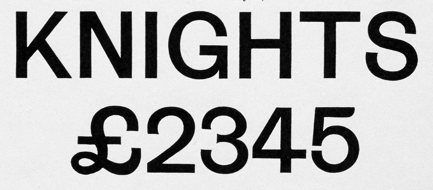
Grotesque caps with similar widths, and lining figures, from a 19th-century type catalog. Miller & Richard, Specimens of Book Newspaper Jobbing and Ornamental Types, Edinburgh and London, 1895.
Grotesque typefaces are often somewhat condensed, and most of the capital letters are equal or near-equal in width, which is very different from the proportions of traditional Roman capitals. There is usually a spur on the capital G; lowercase a and g may be either single-story or double-story. Grotesques generally feature lining figures, the same height as the caps. Commonly (though not always), the italic is a slanted roman.
A neo-grotesque takes these iconic characteristics and plays with them, either intensifying them or modifying them in some way. The idea behind most neo-grotesques is to make the form somehow more versatile, more up-to-date, while maintaining the functional appearance that makes grotesques so popular for everyday typesetting. The focus — just as in the 19th century — is still on plain “job-work.”